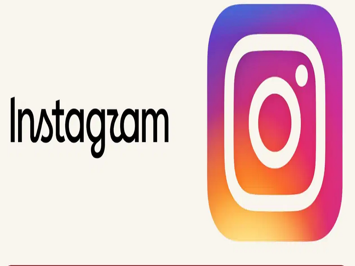
Instagram has given one of its most recognizable design elements a fresh look after nearly a decade. However, the change is smaller than a complete logo redesign. The company has updated the Instagram wordmark displayed at the top of the app, while the familiar multicolour camera icon remains unchanged.
Instagram says the refreshed typography is cleaner, more modern, and still reflects the platform's original visual identity. But instead of receiving widespread praise, the update has quickly become a subject of jokes and criticism online.
Instagram's wordmark gets a makeover
The Instagram wordmark had remained largely unchanged for around 10 years. According to Instagram chief Adam Mosseri, the company felt it was time to refresh the lettering.
The updated design aims to retain the simplicity and character of the previous wordmark while giving it a more contemporary appearance.
Importantly, Instagram has not replaced its iconic multicolour camera symbol. The main change is limited to the lettering used for the platform's name.
Why are people making fun of the new design?
The reaction from users has been mixed, with many people saying they initially struggled to read the new lettering.
Some users jokingly interpreted the redesigned wordmark as completely different words, including variations such as “Instagjam,” “Instagwam,” and “Instaguaam.”
The jokes quickly spread across social media, with users sharing their interpretations of what the new lettering appears to say.
Others have raised a more serious concern: whether the redesigned typeface is sufficiently clear and accessible for everyone.
Users question the readability
While Instagram describes the new wordmark as cleaner and more modern, some users believe the design has made the name harder to recognize.
A logo or wordmark needs to be visually distinctive, but it also needs to remain easy to read. The criticism suggests that some users feel Instagram may have prioritised style over readability with the update.
Whether the new design becomes more familiar over time remains to be seen.
Some users want Instagram to focus on bigger problems
The discussion has also moved beyond the logo itself.
Some Instagram users responded to Mosseri's announcement by pointing out issues they consider more important than a visual redesign. Among the concerns raised were account suspensions, problems faced by creators and businesses, and difficulties getting adequate support when accounts are restricted or removed.
For these users, a new wordmark does little to address the practical challenges they face while using the platform.
A small change that created a big reaction
Instagram's latest update may appear minor, but the strong online reaction shows how closely users identify with the platform's visual branding.
The camera icon remains familiar, but the new wordmark has already generated plenty of discussion. Whether users eventually become comfortable with the new typography or continue calling it “Instagjam” and “Instagwam” will likely depend on how quickly the new design becomes part of Instagram's everyday interface.
For now, Instagram appears to have achieved one thing very effectively: getting everyone to talk about its logo.